My old Alma Mater, Pontificia Universidad Catolica del Peru (PUCP), was looking to redesign its mobile app. Its new administration was pushing a digital transformation agenda across all departments.
My consultation required an open collaboration with the IT department and marketing.
The result was an app centered in students daily needs when in campus that best represented the university branding and prestige.
Team
- Project Manager
- Back end Developers
- iOS Developer
- UX/UI Designer (Me)
My role as UX/UI Designer involved getting to know students needs and help define the app’s new set of features. Defined user flow, designed UI and interactions, with low and high fidelity prototypes.
The Challenge
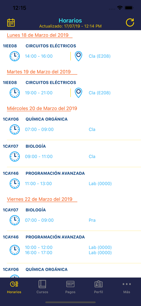
‘PUCP Móvil’ v1 was built as an initiative by the IT department, a direct response from competitor universities’ presence at the App Store.
Unfortunately, no formal design practice was applied and its feature and capabilities didn’t actually address users everyday problems.
Some initial resistance against structural changes in v2 was expected. Thankfully good communication made the team aligned on an important fact: good design is good business.
Getting to know students needs
Rather than focusing on what kind of information the IT department currently holds and can serve to users, I aimed to collect all types of in-campus needs and problems the students had, so I could place the v2 app at the center of campus life.
I conducted an online survey with 83 students participants, along with interviews with the IT department members and Marketing department.
Key Findings
- New students have troubles finding buildings and classroom.
- Because of limited availability, reserving study private space in campus is a challenge.
- Cafeterias are too further apart and you can only check today’s menu by walking to each of them.
- Most of students still make and print their own class schedule, since available resources (web and mobile) are not readable enough and hence not useful.
Objectives
- Increase in downloads at the App Store
- Increase in user satisfaction
- Increase in monthly usage
Satisfying campus needs
The surveys confirmed my initial intuition regarding campus life. Students were facing everyday problems not addressed by v1, which was mainly focused on serving data present on IT department databases (list of courses, list of documents, list of scores, list of sessions).
The team was then committed to help v2 become the center of campus life, starting with these new features:
- Notifications and directions to your next class
- Study pods reservation
- Cafeteria ordering
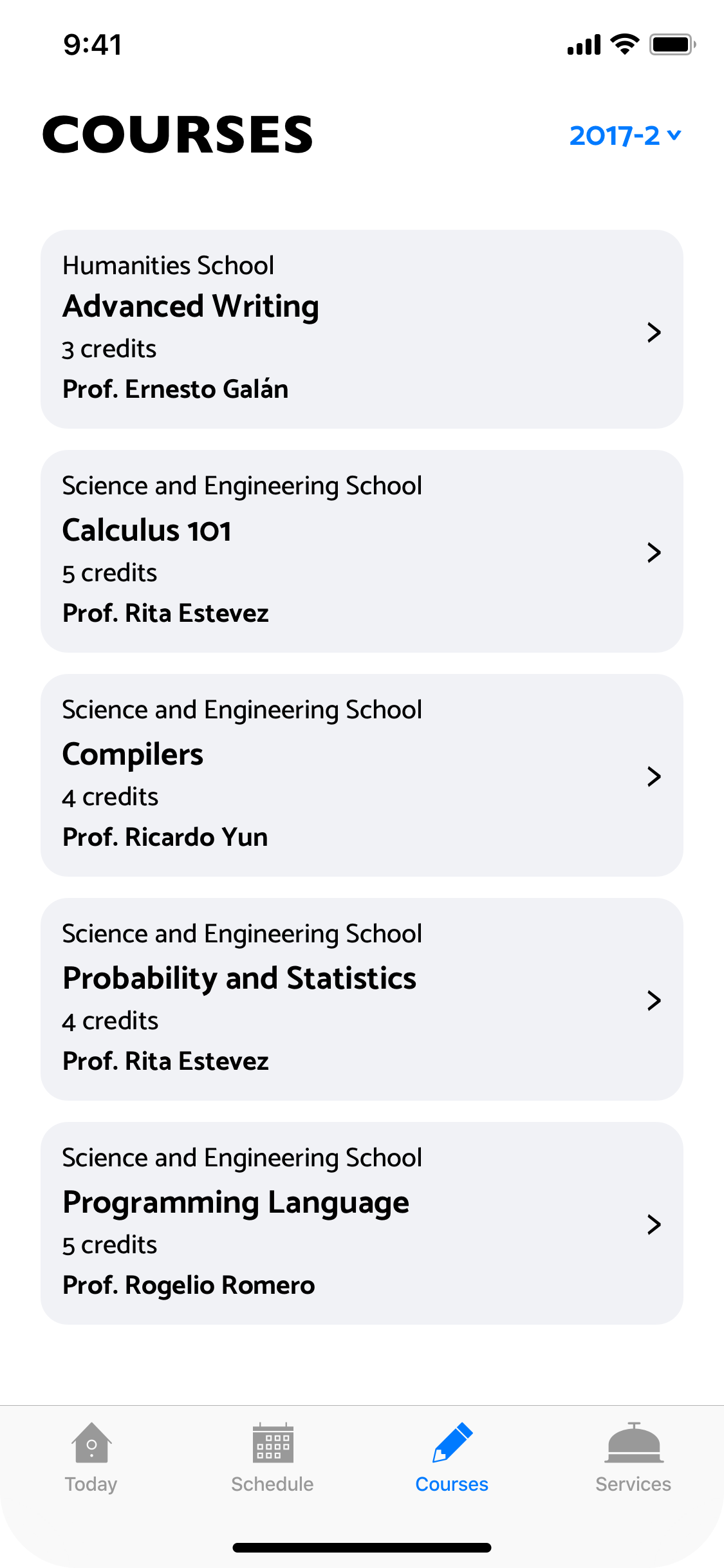
Importantly, all the available information shown by v1 was still there, categorized and presented in a more cohesive way.
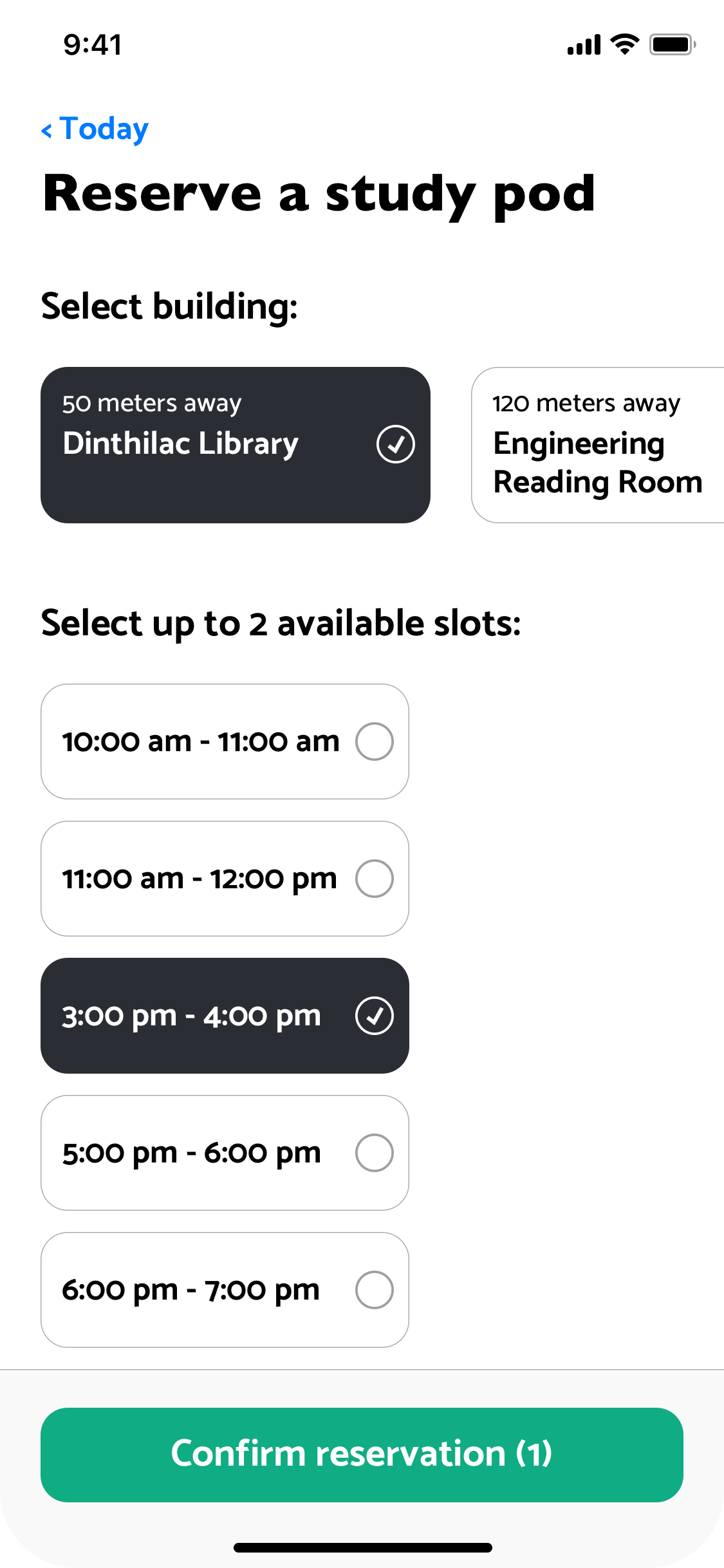
Services taking center stage
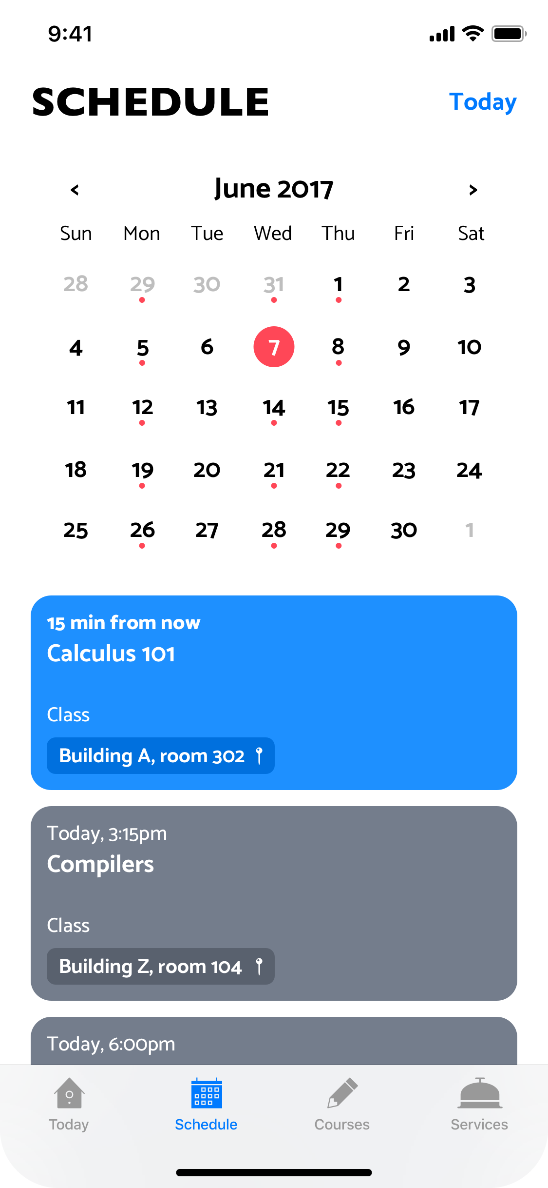
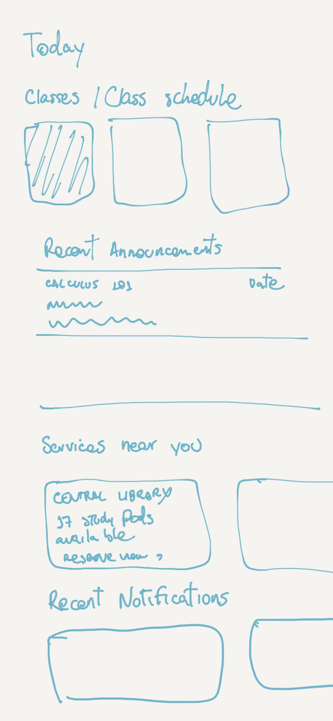
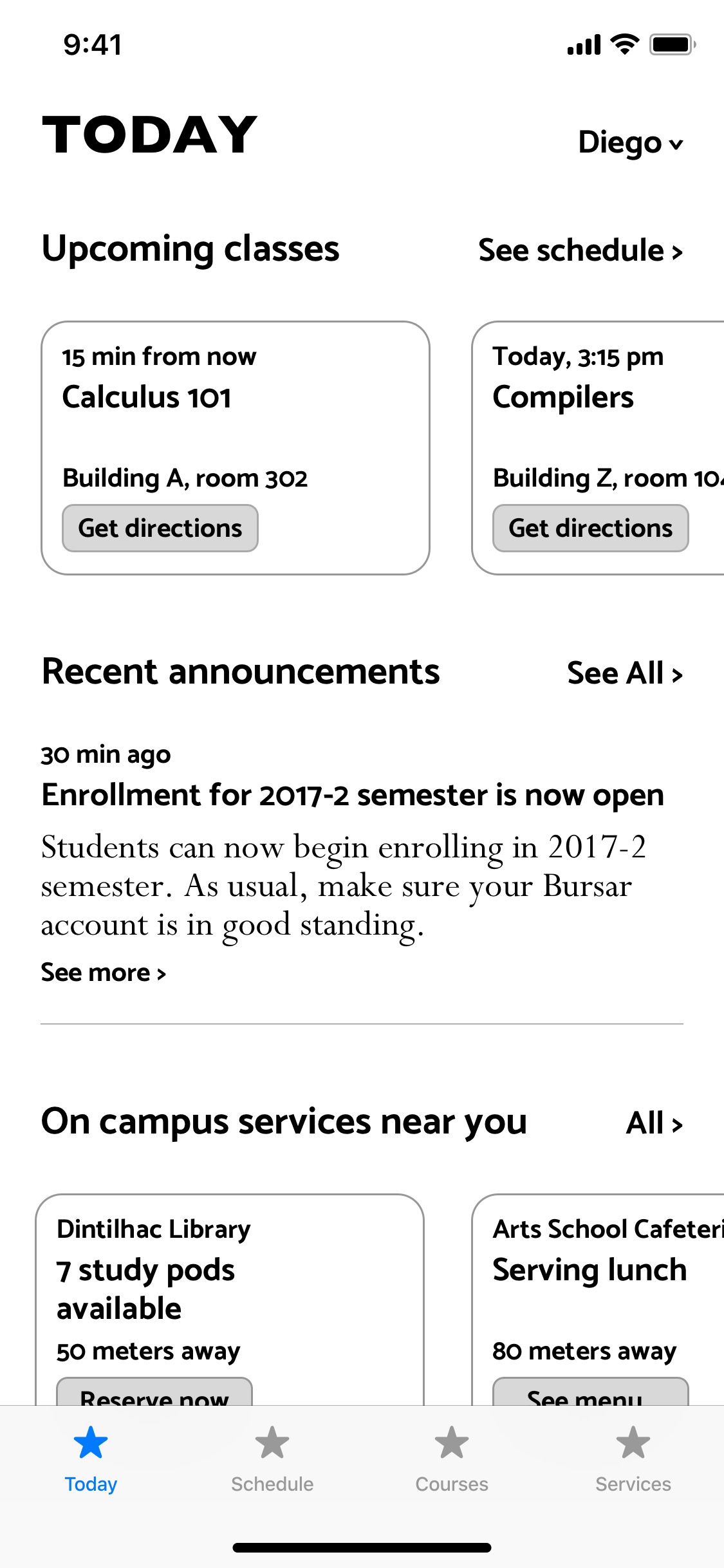
The new tab ‘Today’ contained all important information and actions students could do based on the date/time and current location inside the campus.
A special section was reserved for nearby services, which was planned to expand over the coming years.
Results
- 39% increase in App Store downloads
- 78% of v2 users liked it better than v1, according to an online survey
- 51% of increase in monthly usage
